100 Posters, 134 Squirrels: An Interview with Silkscreen Artist Jay Ryan
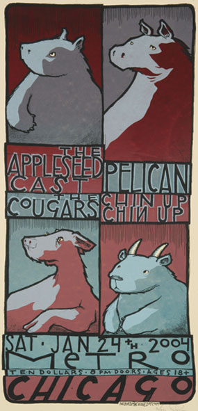
Jay Ryan has risen as one of underground poster art's most prolific and talented artists. His hand-drawn, silkscreen posters have announced Chicago's top concerts for the past decade and his work has been featured in galleries across the U.S. and Europe. More recently he's created billboard work and book covers for Michael Chabon and Bryan Charles. Some of his most compelling work has been compiled in the book 100 Posters, 134 Squirrels: A Decade of Hot Dogs, Large Mammals and Independent Rock. The collection showcases his wistful, readily identifiable style and his preoccupation with animals doing silly things, all in the name of rock 'n roll.
Michael Liss: What is the physical process of silkscreen printing?
Jay Ryan: The posters are designed and drawn by hand; I don't use computers at any stage of the process. That's sort of unusual in this day and age. I start with a pencil drawing on paper, then make a film of it, a black and white transparency. Next I hand-cut different films for each layer of color. So if I'm making a picture of a cat wearing a t-shirt, I would have a drawing, then I might make one film of the shape of the t-shirt and another the shape of the background, and maybe a third the shape of the fur. Then it's just a matter of lining up the different layers of screens on the paper.
ML: How is screen printing a different creative process from painting, drawing or other mediums?
JR: Screen printing is a relatively limited medium in this day and age. The people whose work I respect the most know the parameters of what they're working. For example, having a number of colors. In your typical image today that might be offset-printed or digitally output, there's no limit. With screen printing, each layer of color requires its own screen. You're usually working with a relatively limited palate. Most posters are two-to-four layers of color. I'm usually in the five, six or seven range. You can keep adding colors, but that gets very time consuming. Each new layer requires a new film to be cut, a new screen to be made, and if you're making 100 posters, you have to print that new layer of color one at a time on each of those 100 posters.
ML: How do you feel doing this all by hand informs your aesthetic and imagery?
JR: There's definitely the mark of the creator in the work. Screen printing is an imperfect medium, and culturally we are so used to photoshopped images, where everything is sort of aesthetically perfect, shiny and crisp. There's a lot of poorly-designed work all around us, but the letters are crisp and clean and the picture is shiny and flat. I think there are people who appreciate dirty imagery. I don't mean subject-wise.
ML: Which leads to your phrase "the inherent charm of the process."
JR: That's how we explain thumb prints, scratches in ink, registration issues where maybe the cat's color doesn't quite line up with the outline. As we say here at the shop, "If you want it perfect, don't screen print it."
ML: You used to use computer type for your lettering. When you stopped, how did that change the images you were creating and your process?
JR: It was just a lack of experience and trust in my own work, but I soon realized that my hand-drawing type had enough character on its own.
 ML: Some images then became text-heavy.
JR: Yeah. Because the text is drawn, I look at it the same way as I would the image. Hopefully the text is interesting enough to hold its place in the composition and isn't secondary. It's not like a caption.
ML: How would you describe your drawing style?
JR: I don't know if I could put a name on it. There are a lot of animals. There's movement because of the dirtiness of the drawing style. There's definitely a whimsical, children's book sort of quality. I don't feel any need to be, “naughty,” or try to scare or impress you with how tough I am, like you see in a lot of posters or record covers. The goal in making my posters is not to make your mom mad at you.
ML: How did animals become such a theme?
JR: Animals doing funny people stuff is funny. I like that they can stand in as characters that can be read different ways by different people. If I were to draw a man driving a car, he's got a certain haircut, and is he wearing a t-shirt or a collar shirt, does he look like he's a particular ethnicity? All these things inform the way we identify with him or not. If I put a bear driving that car, we all could plausibly look at that bear and feel like, oh, that's a bear, or oh, that's kind of like me. This is something I've only recently started to realize. Mostly, I just do it because I like animals.
ML: How well do you feel you have to know a band's music to do a poster?
JR: I definitely work best for a band that I'm a big fan of. If I'm not very familiar with them, I try to immerse myself in their music. There's a chance the poster might have nothing at all to do with the band.
I got asked to do a poster for a High on Fire show. They're regarded as very popular heavy metal. I didn't know much about them. I got a couple of their albums and tried to do a poster that I thought was appropriate and missed pretty widely. I like the poster. It's an image of a yeti mowing his lawn, howling in anger with a lot of energy radiating around him. When I was doing it, it looked like a loud poster, but by the time I was done it felt goofier than the band is. They told me they liked it, but their fans told me they didn't think it was really appropriate.
ML: Is it harder to make a poster for a band whose music you don't like?
JR: I've made some really good posters that I like for bands that I don't like, but it's easier working for one of my favorite bands, where I can add some subtle references to their music.
ML: Is it easier or harder to do posters for your own band or art exhibitions?
JR: It's probably easier, because I can just be as goofy as I want. I don't have anybody to answer to except myself. So my expectations are lower. (Laughs.)
 ML: There are a lot of squirrels in your work.
JR: They did sort of unintentionally become a theme. They're fun to draw because of their movement, and that they're easily recognizable with that big tail. I had made a couple of posters that included squirrels and then made a poster for Shellac. They said you can do whatever you want, but if you want to include a squirrel, we did just finish this song about squirrels. So I decided to do this big pile of them. And that became a poster that a lot of people paid attention to. So squirrels sort of became my territory.
ML: If you could do a poster for one band from before you started, what would it be?
JR: Thankfully, some of the ones that come to mind I did eventually get to work for. I'd like to do a Radiohead poster. They're one of my favorite bands.
ML: Some of Radiohead's more recent artwork, especially their minotaur imagery, really ties in with what you're doing.
JR: Exactly. It actually made me mad when they started doing that stuff. The whole Kid A artwork just completely kicked my ass, and then it just got better from there going into Amnesiac. The new images they posted on their website also make me happy and jealous and angry all at the same time. It's like, why didn't I do that myself earlier?
ML: Is it a different process to do a book cover than a concert poster?
JR: It's an entirely different process. There are a lot of layers of approval. With the posters, you hire me and you don't hear from me again until you get your poster. I don't charge enough to have the patience to put up with a lot of criticism. I look at them as rather personal interpretations of the band that I'm working for. But with book covers, there's a lot of making sure that what they want is what they're getting, that I'm reading the project correctly.
ML: Are the layers of approval constraining?
JR: No, no, it's great. But they're also paying for that, for my time as far as the revisions. I don't mind it at all. Ultimately I think I end up with a nicer image, one that's more appropriate.
ML: How did you come up with the illustration for Grab On to Me Tightly as if I Knew the Way, by Bryan Charles?
JR: One of the themes of the book is a young man who's exploding in all the ways that 18-year-old boys do, and he's constantly being roped in and brought back to earth by various women in the book.
ML: Which is why he's illustrated as a kite on a string.
JR: Yeah, that's one analogy. Trying to keep some degree of control over himself while being thrown from his high school, living-at-home world.
ML: Would you like to do more book work?
JR: I love doing book work. I'd like to do more of that. It's a different kind of work that balances nicely with the posters that I do most of the time.


